Tuft & Needle (T&N) disrupted the mattress industry in 2012 with its direct‑to‑consumer bed‑in‑a‑box model. Originally an online-only retailer, T&N has since expanded into brick‑and‑mortar stores across major U.S. markets—Seattle, Portland, Raleigh, Dallas, Phoenix, and beyond—while maintaining its reputation for transparency, quality, and customer‑first innovation. Here are a few samples of my contributions.
My Roles and Responsibilities:
Joining during T&N’s merger with Serta Simmons Bedding (SSB) as a Senior UX Designer, I led UX, usability, and conversion‑rate optimization (CRO) for the Purchase Experience (PX) team. In parallel, I shaped growth‑marketing design strategy and managed the design systems for SSB’s House of Brands. Key responsibilities:
As T&N scaled—both online and into retail—several core challenges emerged:
As Senior Designer on T&N’s growth team, I owned the end-to-end workflow for major promotions, standardizing asset templates, establishing a collaborative ideation framework in Mural, and partnering with channel leads (Facebook, Google, affiliates, and organic social) to align creative with each channel’s nuances.
Initial Planning
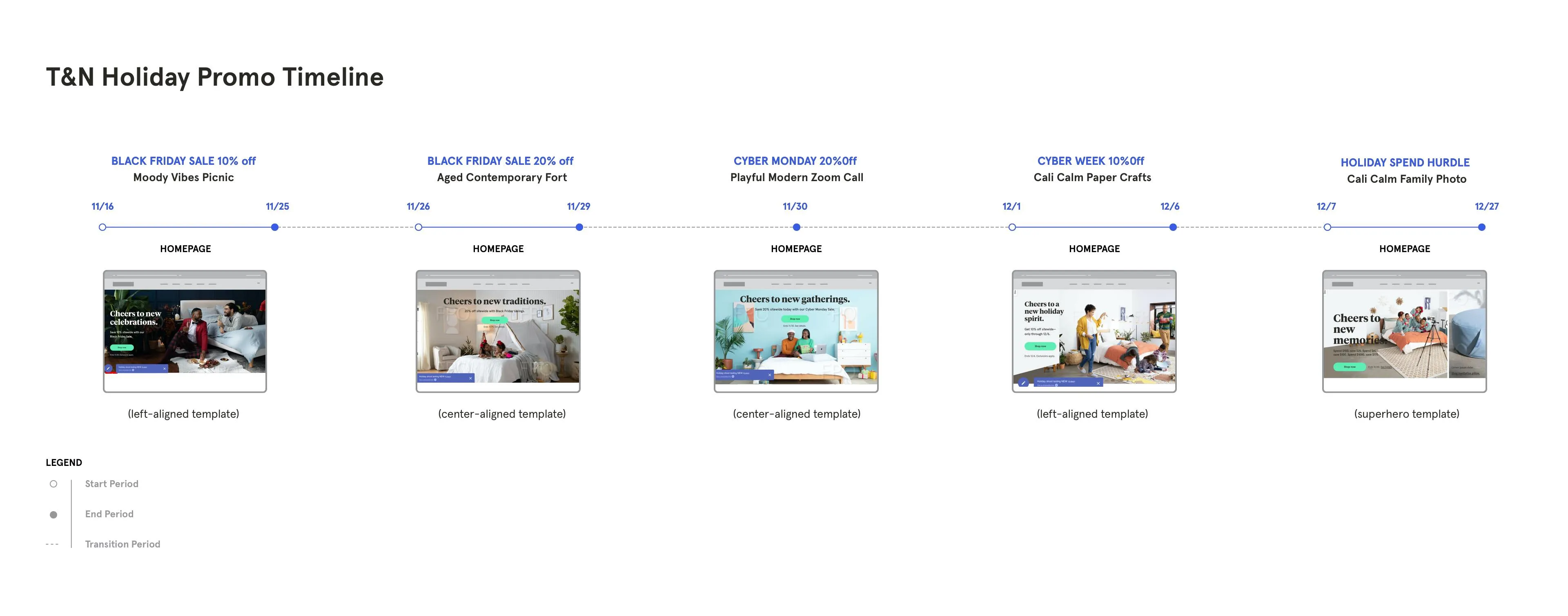
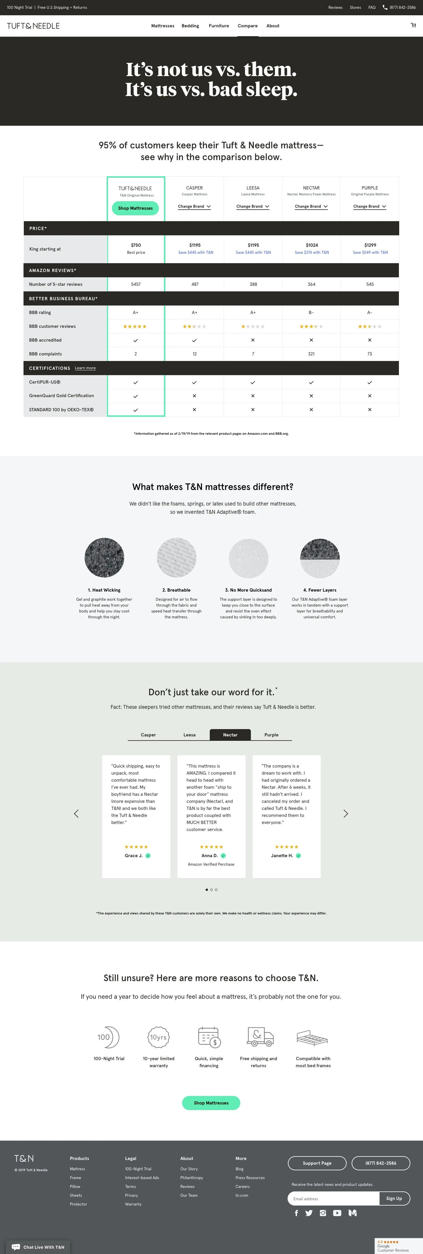
Marketing Brief Kickoff & Research - The kickoff is where we are informed of the sale offer, dates, competitive analysis, world events and other details pertaining to the sales period. We came into the the Labor Day kickoff knowing the odds were stacked against us due to the Covid-19 pandemic. Creating a campaign that would resonate with our customers and stand out from the competition was going to be a challenge. As for our sale, we decided to offer a 10% site wide discount from 08/18-09/07. Working with channel owners, we reviewed past performance, competitor campaigns, and holiday insights, pinpointing top creative attributes—like in-situ photography for affiliates and direct messaging.
Brainstorm and theme selection - In two rounds of Mural workshops, I led the team into the process of narrowing down overarching themes for the promotion. This led us into the “Summertime in the Bedroom” staycation theme—an oasis-in-your-home concept inspired by life under quarantine (first session). The second workshop session centered on brainstorming art directions to help communicate the theme. Here is where the creative direction is locked and special requests from channel owners are prioritized. Promo testing methods are often times determined at this point.
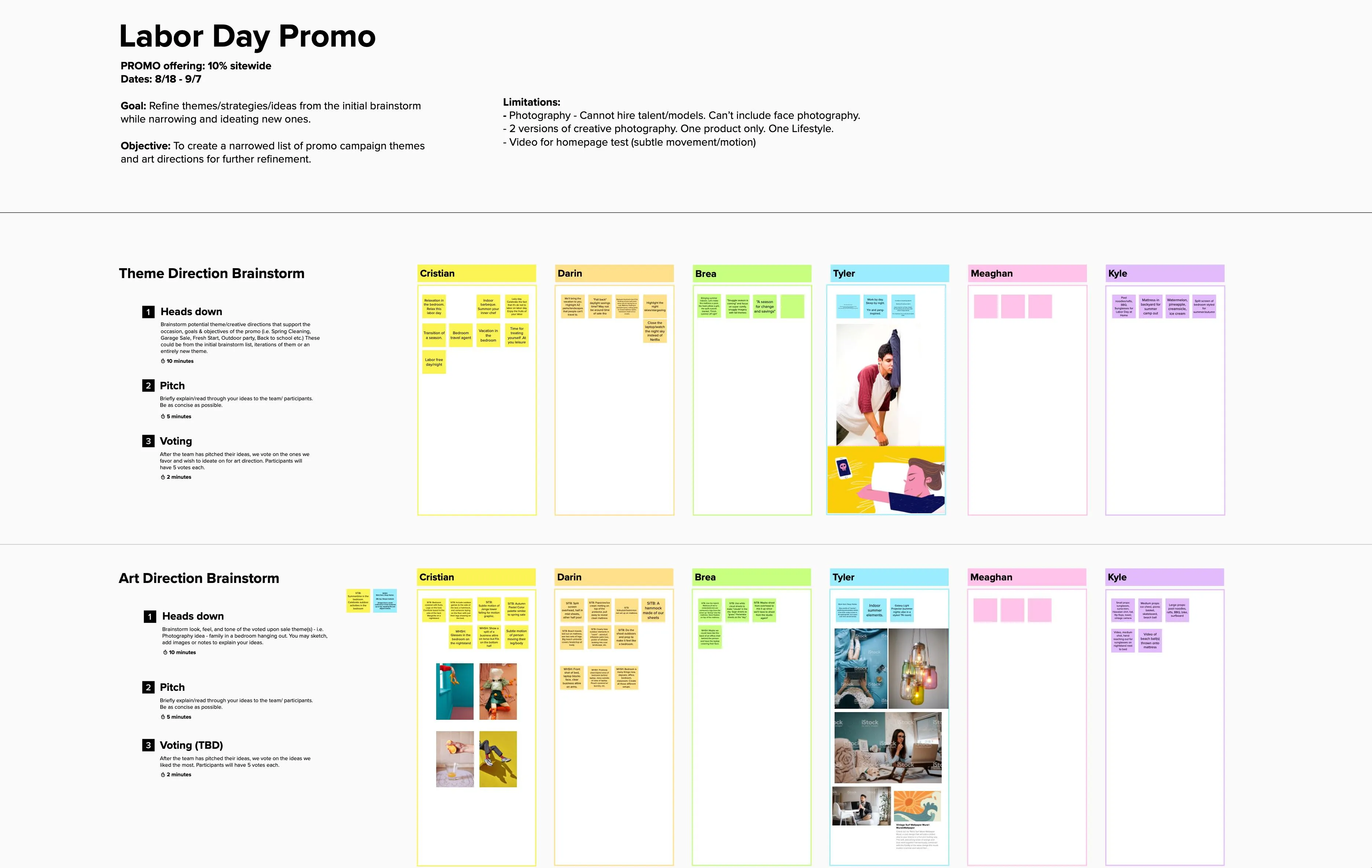
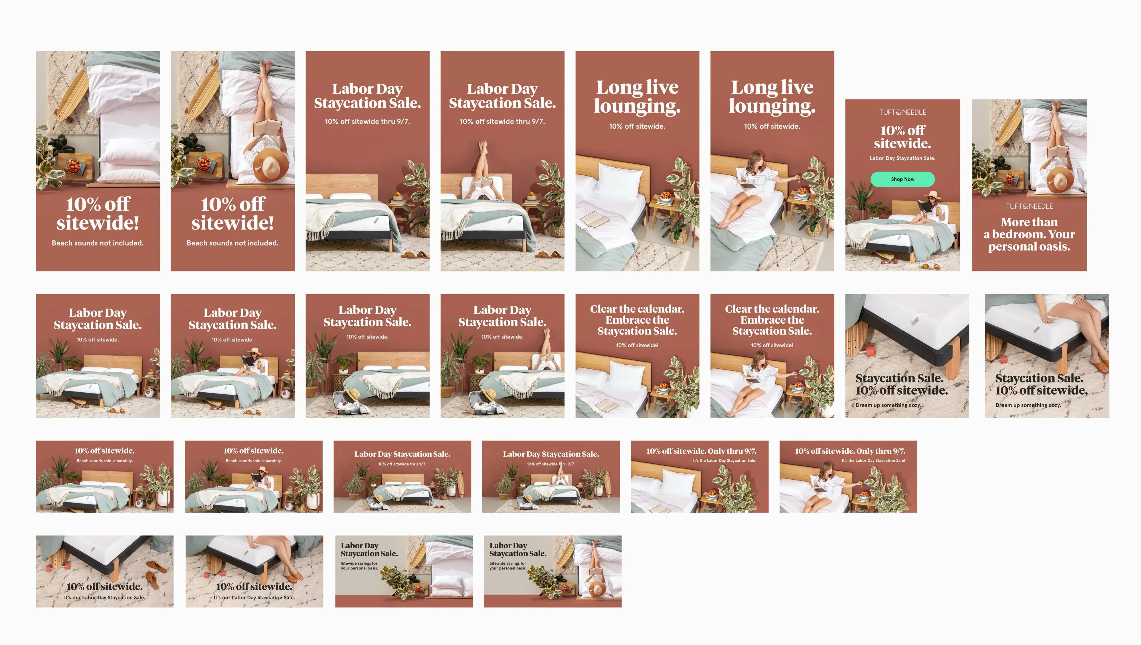
We then prioritized special requests from channel owners and defined our testing approach: we’d shoot two versions of every asset (lifestyle with talent vs. in-situ without) in the same setting to compare ad and e-comm performance under the staycation narrative.
Concepting & Photoshoot
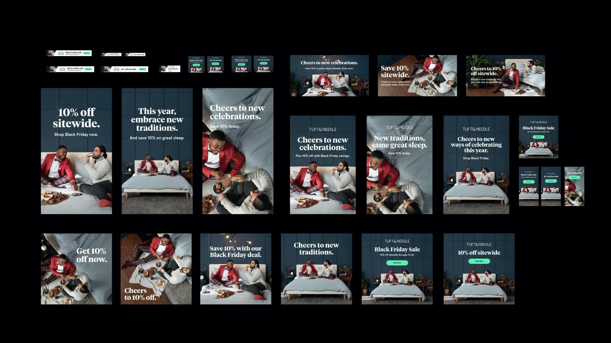
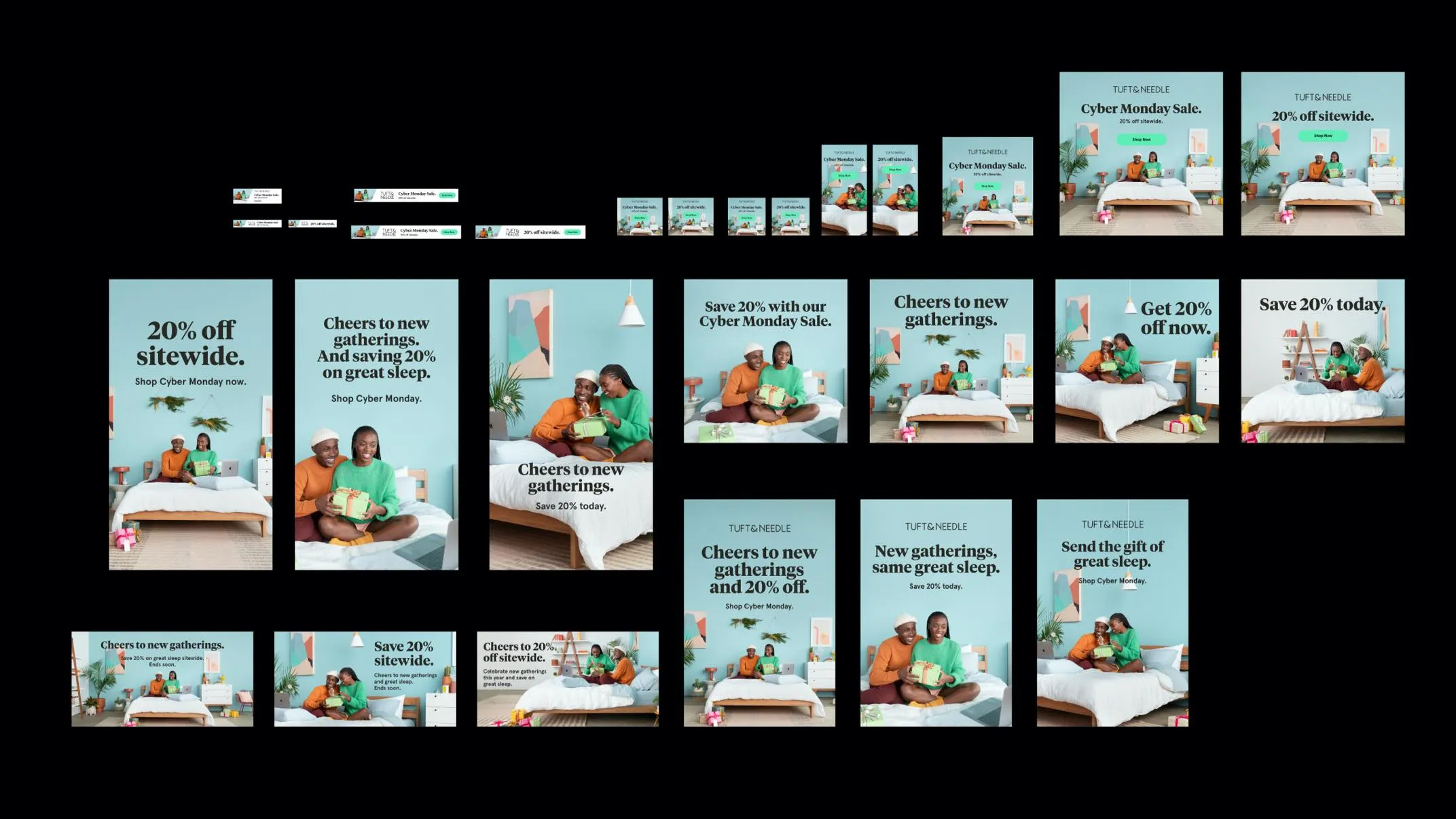
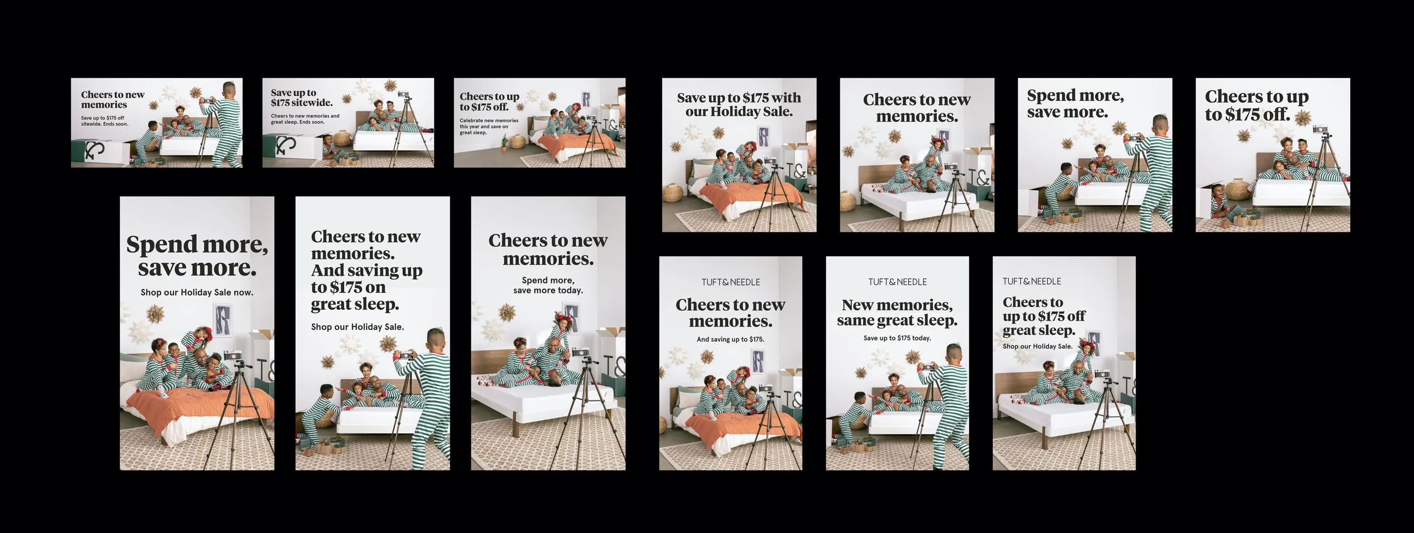
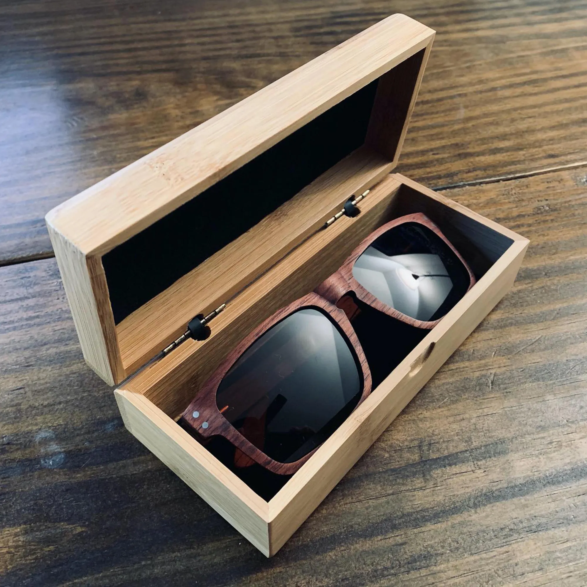
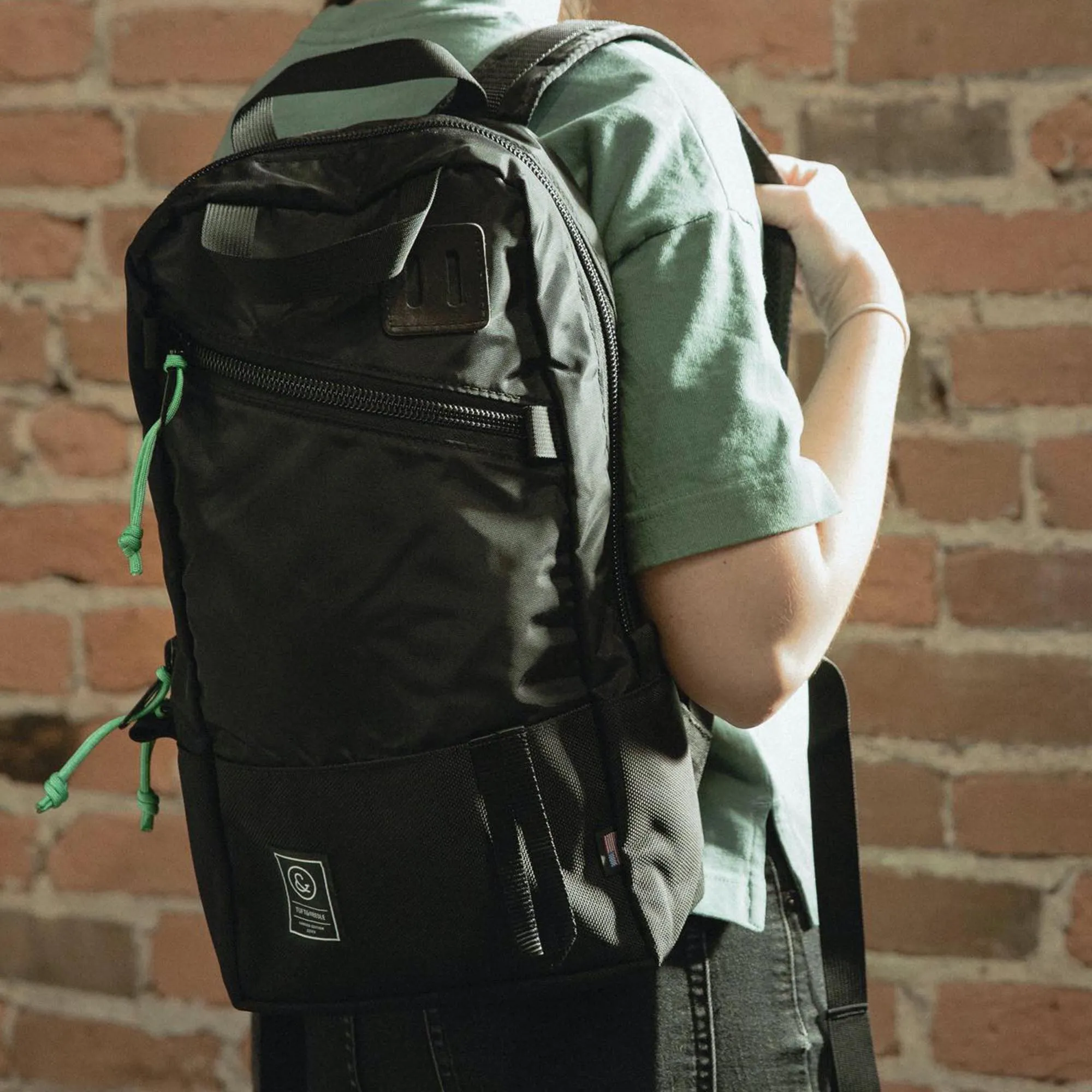
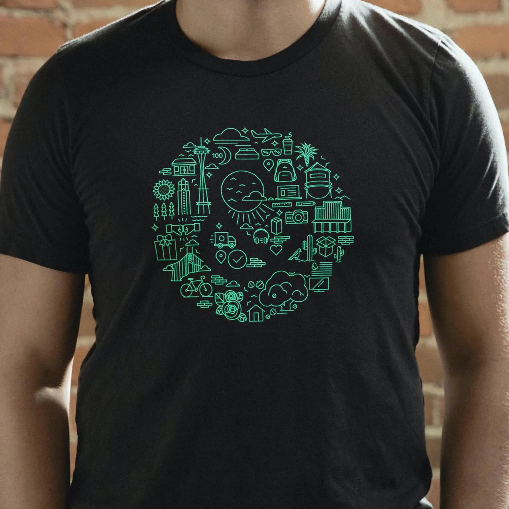
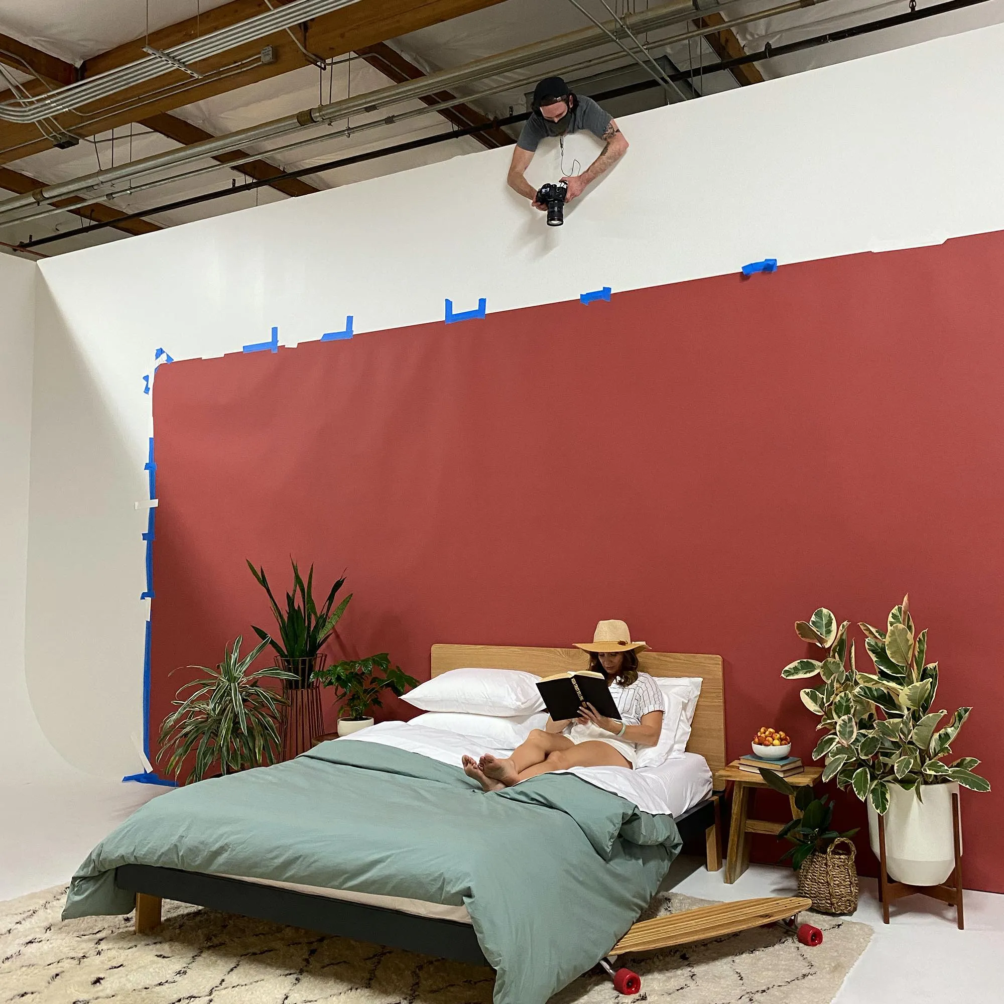
With the theme locked, I drafted a creative brief—including messaging, shot list, props, and talent directions—and remotely art-directed the photoshoot via video with our photography team. My detailed shot list ensured every asset—from e-comm banners to retail ads—was captured according to our vision
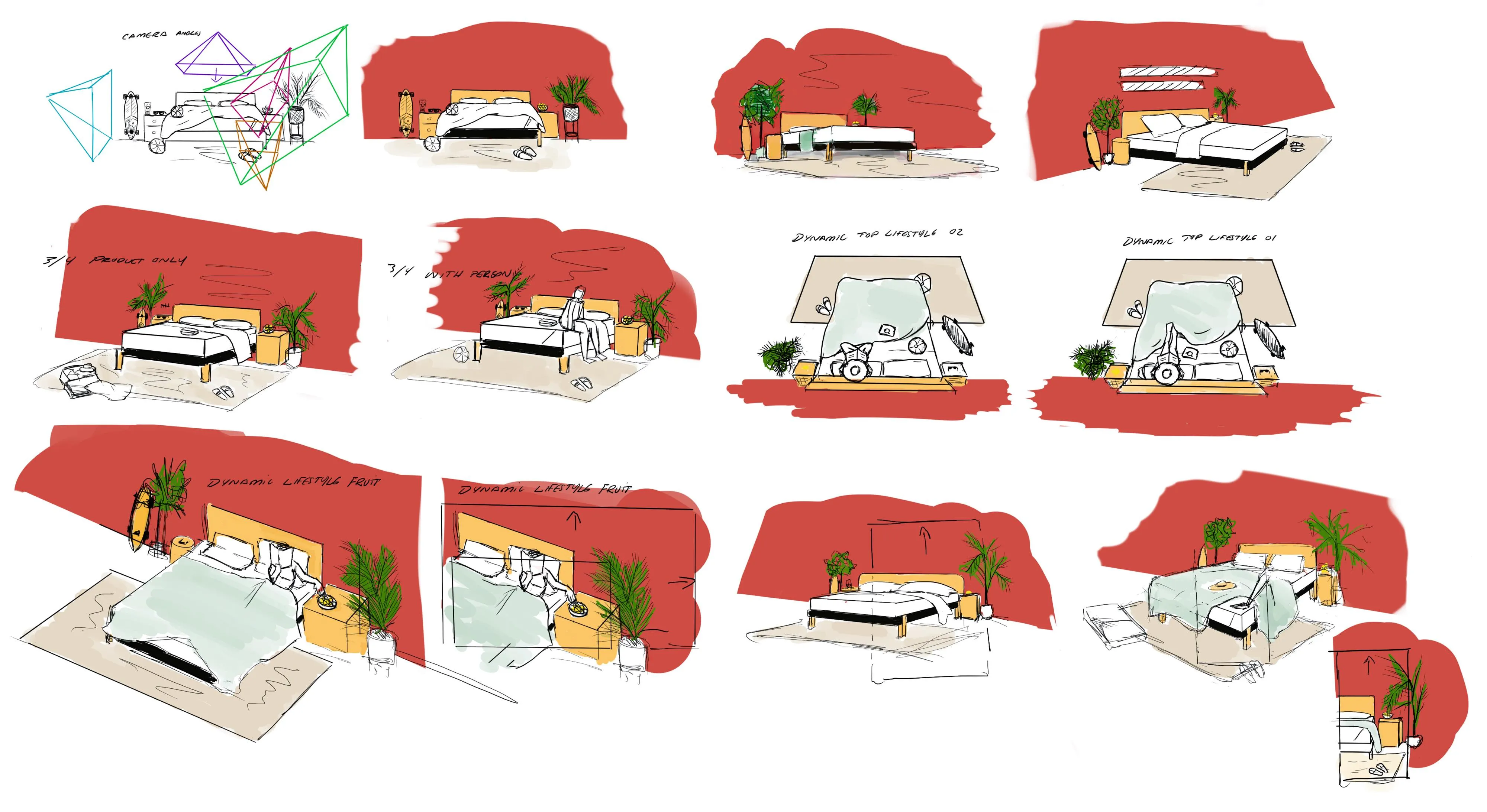
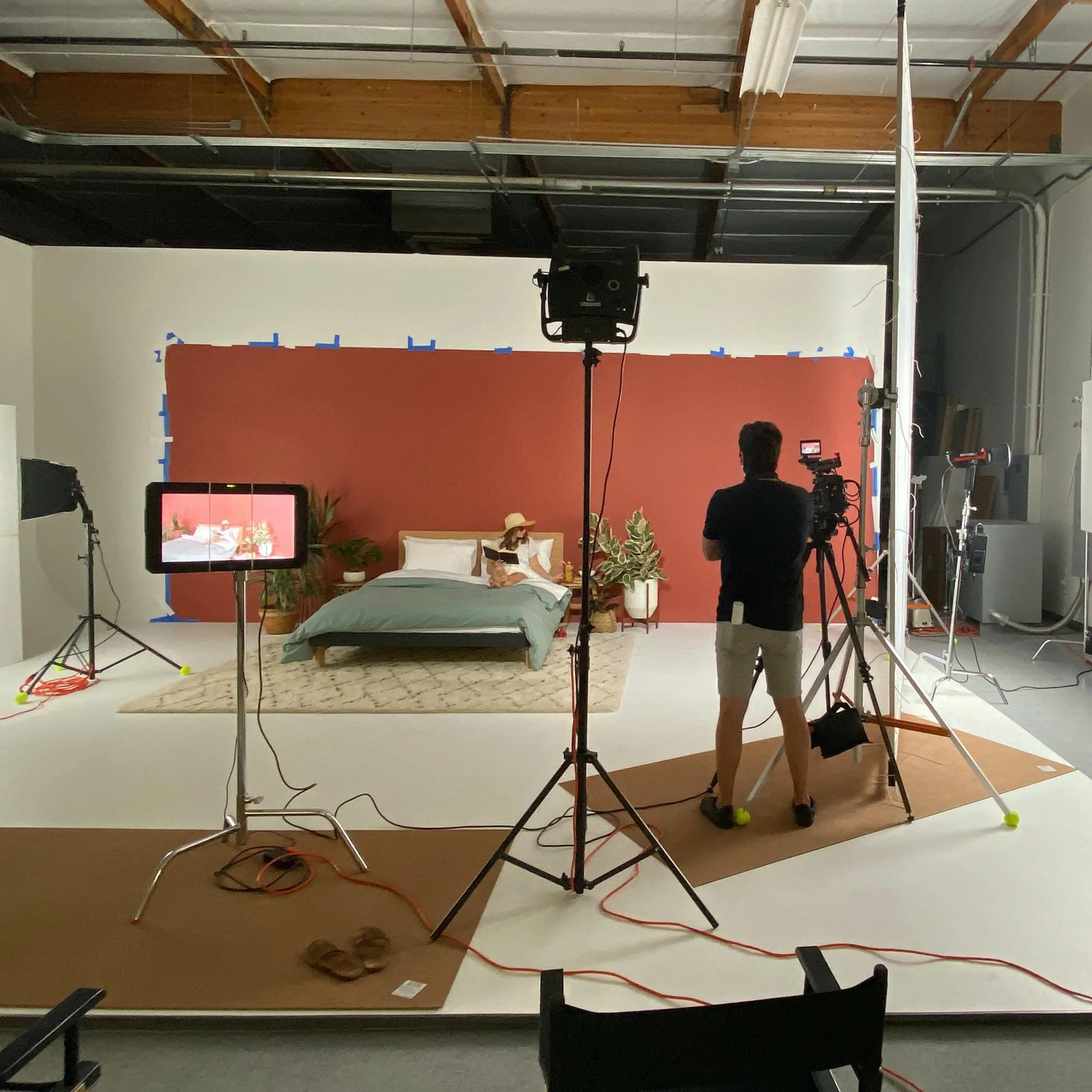
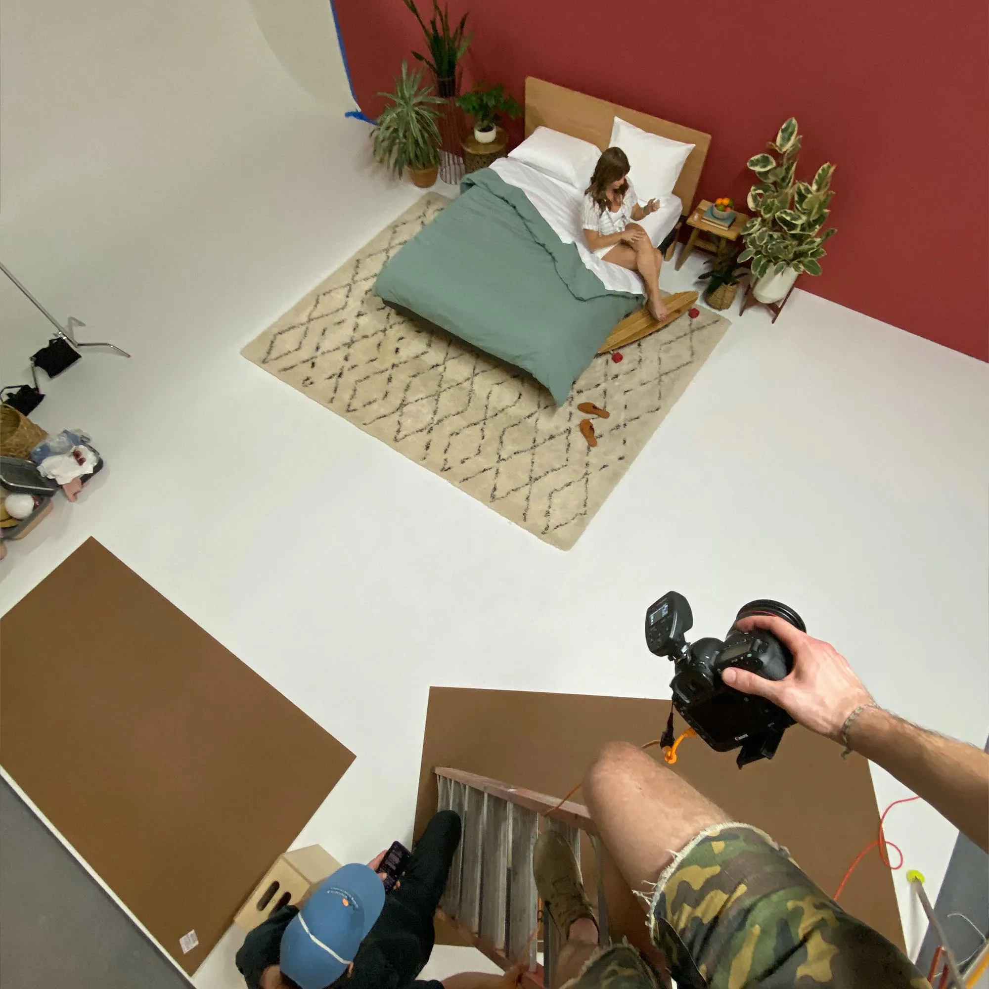
Photoshoot - Art directors and photographers reference the creative brief and shot list throughout the shoot to gather all photography assets needed for production. Due to the covid circumstances, I was forced to stay remote and art direct and monitor over video. This is where the shot list I created with the photographers really came in handy. The shot list had detailed actions and illustrations to depict how the photography would be used in various media. These assets are used across the Tuft & Needle site, retail locations ads, videos, and other marketing materials.
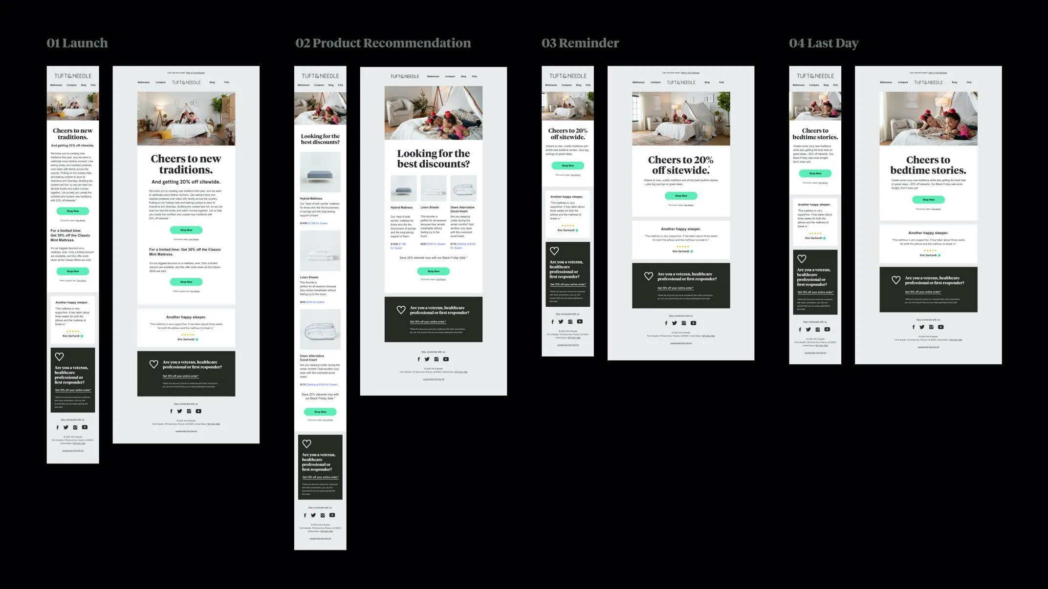
Asset Production, QA & Launch
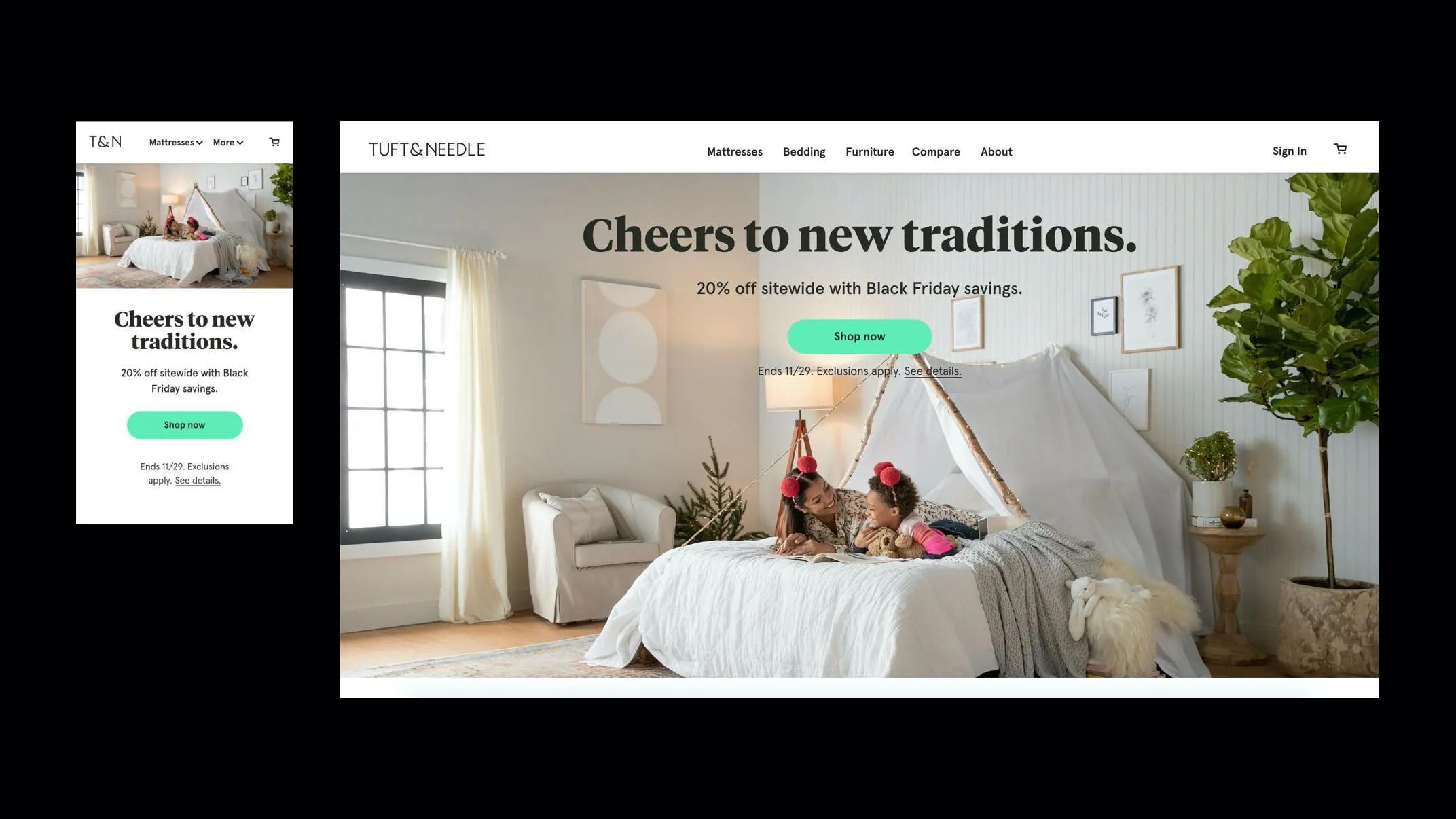
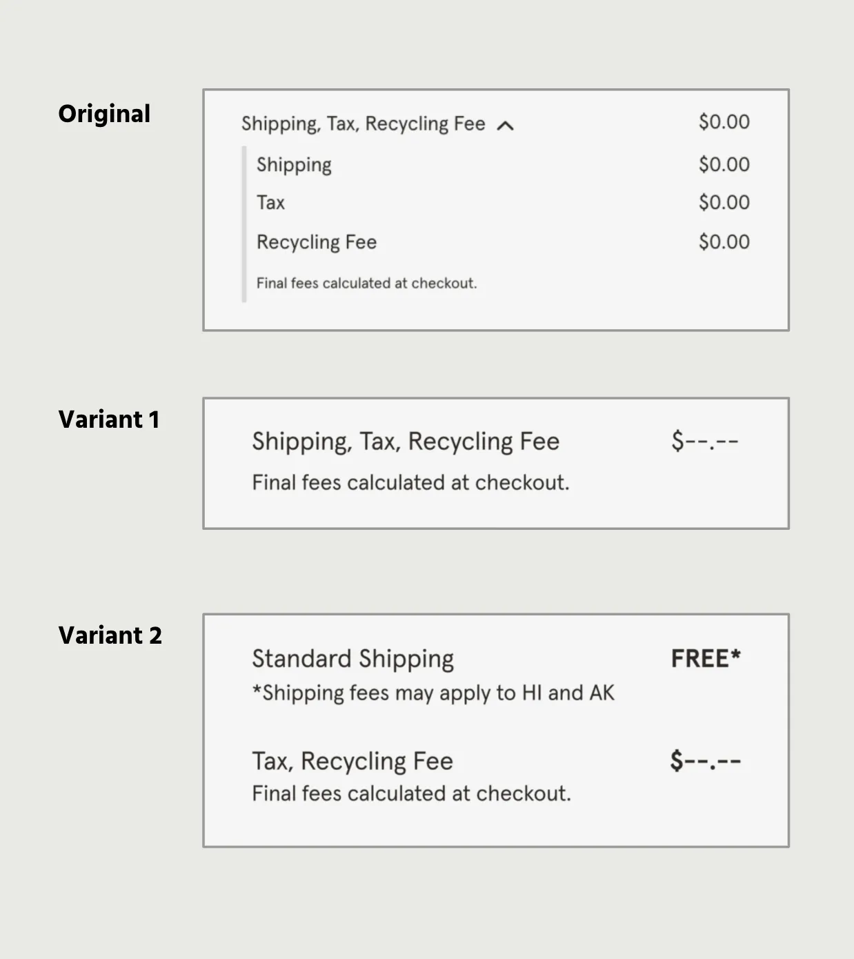
All asset requests listed in the marketing brief i.e ecommerce additions, Ads, emails, videos, content etc. are produced. Qualitative tests are performed and assets altered if necessary at this time. Due to the tight 4 week turn around, our qualitative ad test, although prepared, would carry less weight for this promotion. We instead leaned on historical data and quantitative research for this promotion and allowed the planned qualitative test to inform future creative with similar attributes instead. Final assets passed rigorous QA before being scheduled across channels.
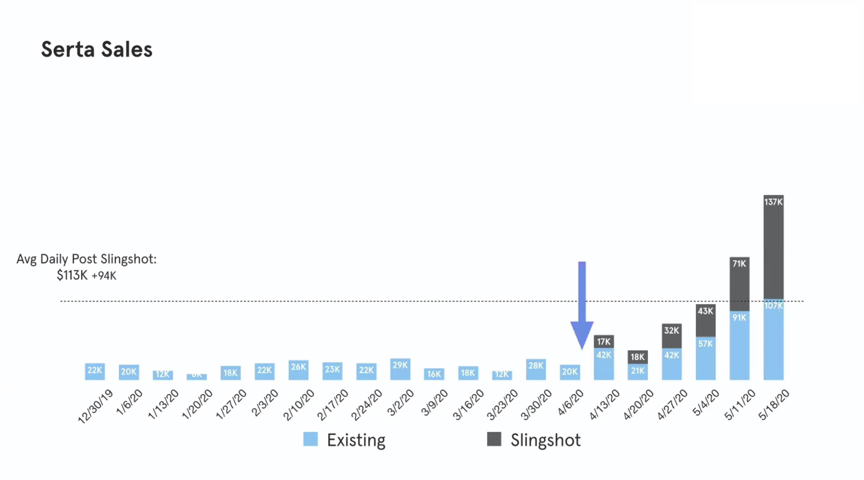
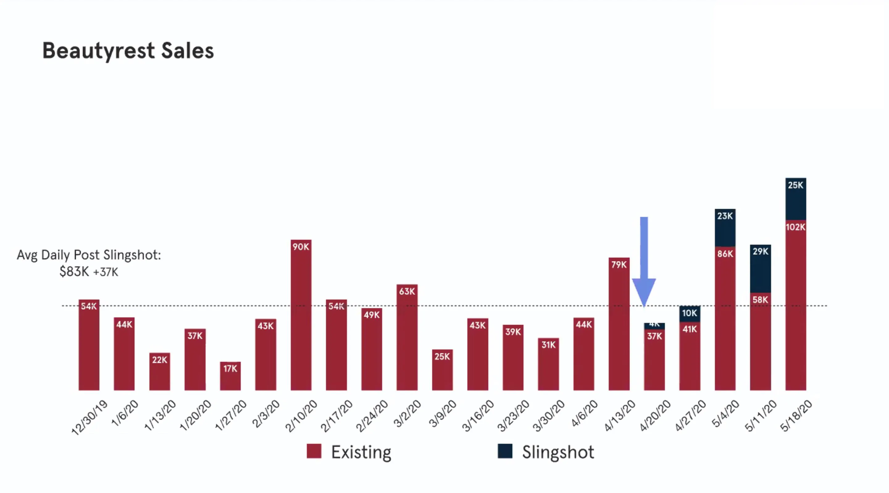
Outcomes and Results
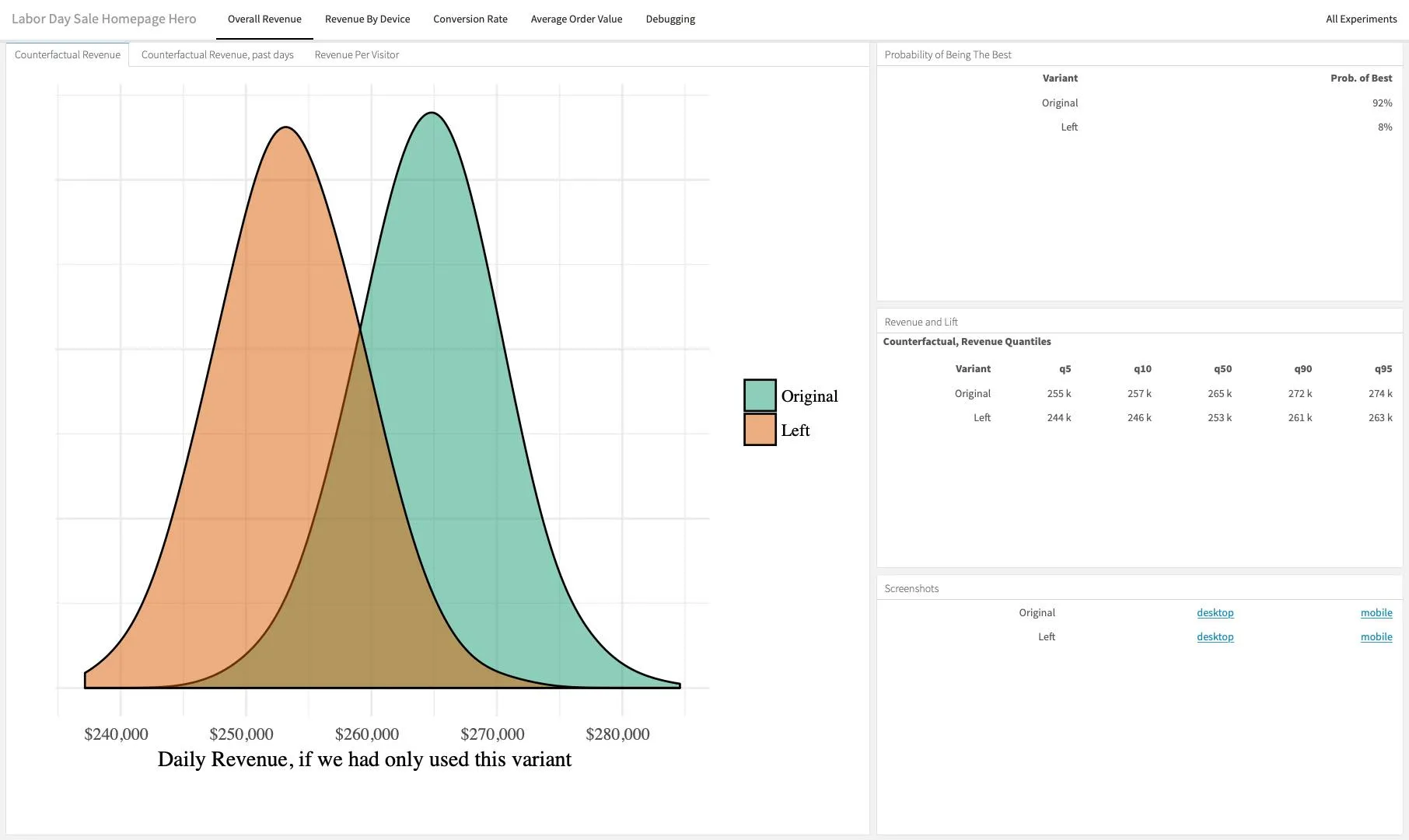
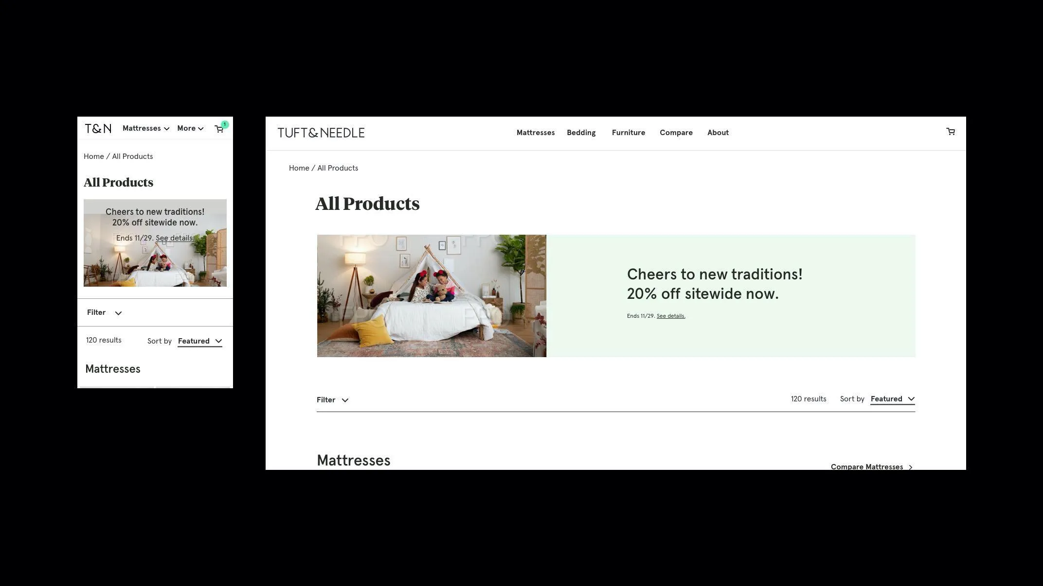
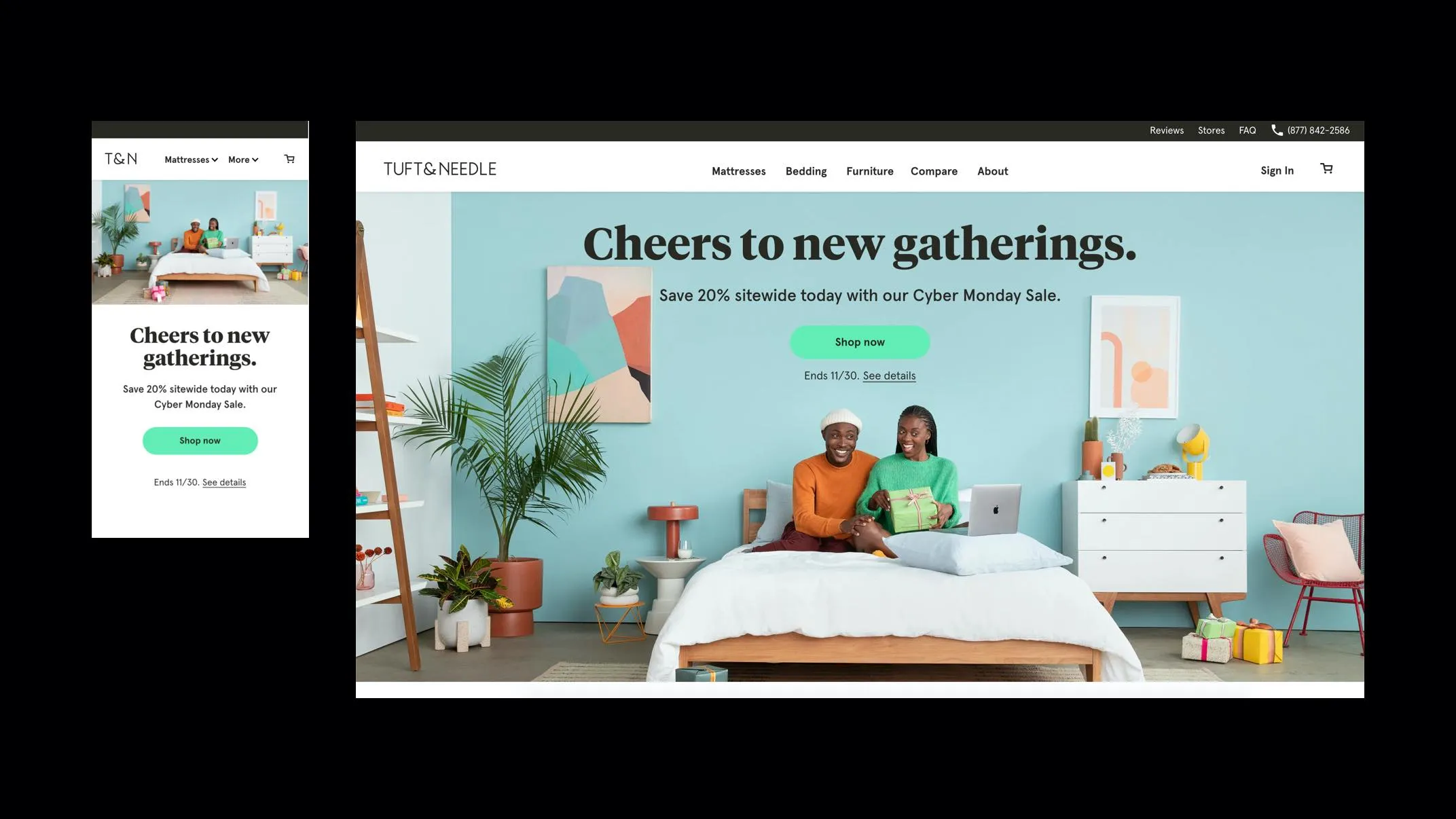
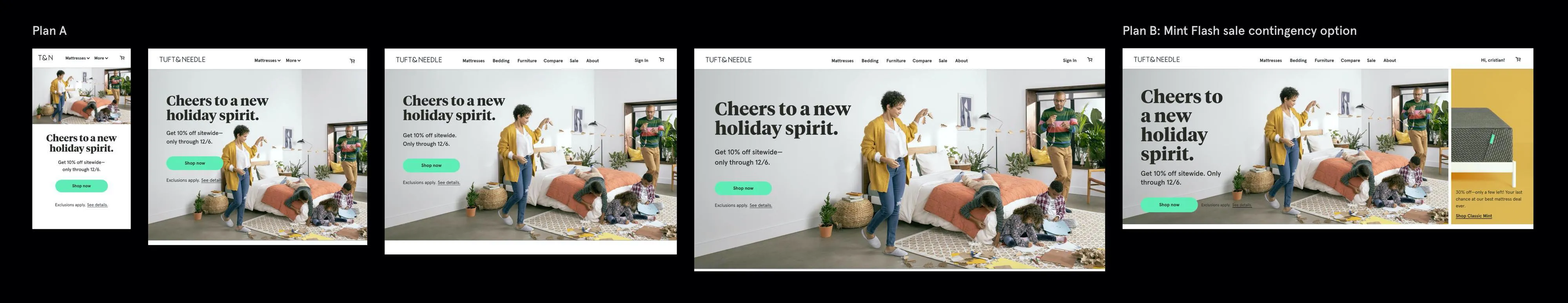
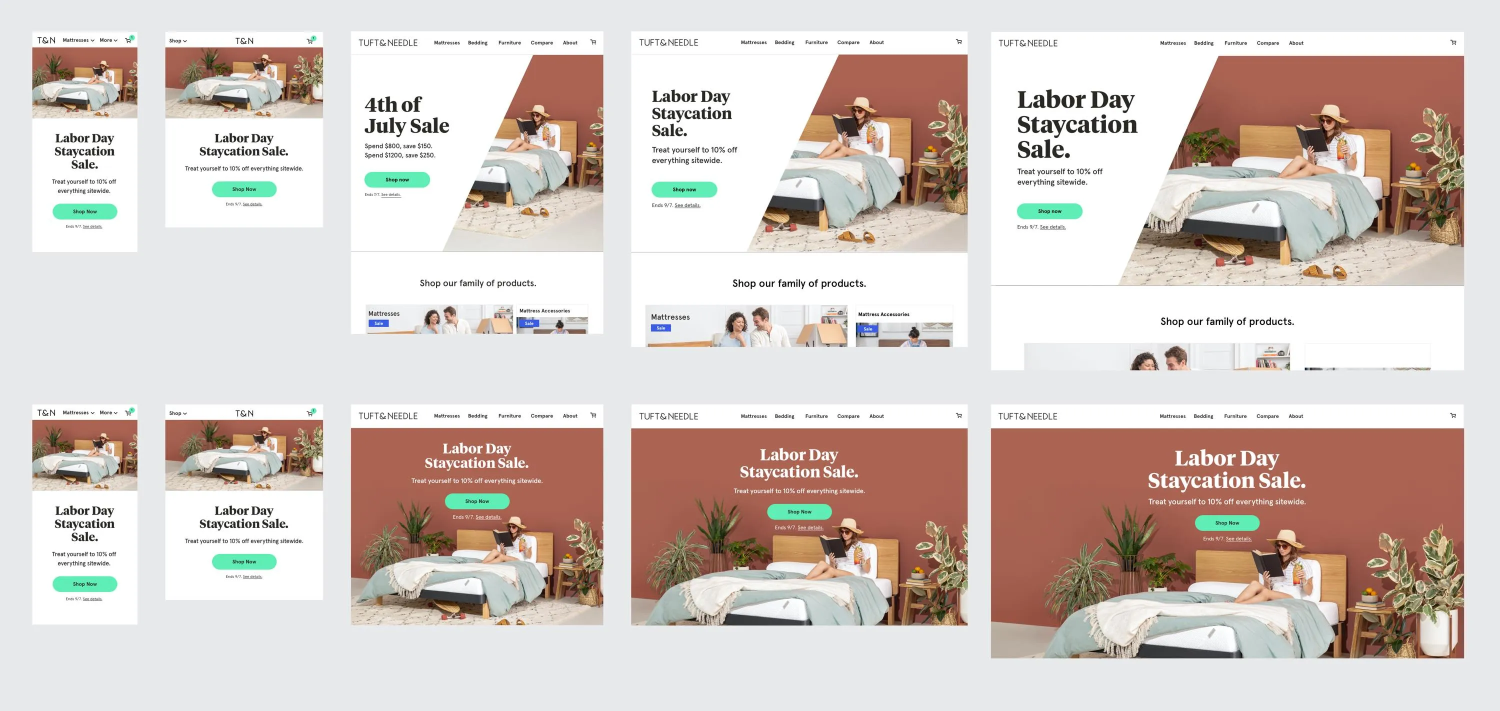
Homepage Hero Testing -
During the start of the sale, we reviewed the data and concluded that there wasn't a major difference with the homepage variations. The full bleed lifestyle variation (aka original) performed slightly better which fell in line with previous tests with similar variants. Overall we found that the full bleed original variant had a 92% probability of performing the best. The left "slash" template fell behind at 8%.
Performance:
The Labor Day promotion delivered the highest single-day revenue of the year—nearly doubling YoY performance—and the second highest day in the company history. It also achieved the highest paid social Impression to Link Click Rate - 0.34% compared to previous 3 promotions within Q3.
Using the Labor Day process as a blueprint, I spearheaded T&N’s largest campaign of the year—a holiday initiative combining five back-to-back promotions. Stepping in as de facto promotion director, I led strategy, research, multi-stage ideation workshops, art direction, and the execution of over 500 assets across e-comm, ads, and email. I also handled CMS implementation, QA, and created a visual timeline to keep the team aligned.
The Result
Record-breaking performance during COVID, including T&N’s 3rd highest gross revenue day in company history.
Black Friday Part: 1
Black Friday Part: 2
Cyber Monday Sale
Cyber Week Sale
Holiday Spend Hurdle
Overview:
Benchmarking was a standard practice that my team conducted in order to measure ease of use throughout the e-comm web experience. This allowed us to identify key areas of improvement. Our benchmarking scores were broken down by tasks where we directed users through the T&N e-commerce store and asked them to rate ease of use (usability) of the task on a scale of 1-5. Our scores were evaluated against our competitors for the same tasks on their platforms.
Remove item from cart:
One area of friction was the within the mobile experience of the cart page where users were instructed to remove an item from their cart. Users rated the experience a 3.9/5 which was considered very low. Our goal was to improve our score as close to a 5 as possible.
Solution:
Added an inline “Remove” link to product cards and a “0” option in the quantity dropdown.
Impact:
Usability scores climbed closer to our 5‑point goal, smoothing a key mobile task and reducing cart friction.
Overview:
As part of a conversion rate optimization (CRO) initiative, our e-comm product teams gathered to significantly improve performance and conversions within their areas of the e-commerce funnel. As the UX lead on the Purchase Experience (PX) team, I led UX and CRO for the customer journey that covered the customer journey from "add to cart" into the checkout and post checkout experiences.
In order to effectively identify areas of improvement, I lead a CRO brainstorming workshop where I preemptively conducted a UX audit of the PX funnel and evaluated the experience against UX best practices using Baymard research and our own analytics. I presented these findings to the team where we brainstormed, voted on and prioritized the suggestions for the site. Here is an example of a test I created and it's outcome.
Cart Page: Adding Estimated Tax, Shipping and Recycling info
Problem:
Our calculated cart fees were a bit misleading and didn't provided an accurate depiction of estimated cost to the user.
Hypothesis:
By providing more transparency within our cart in regards to estimating fees we will drive users into checkout and increase the probability of a purchase order.
Supporting Research Data:
Baymard shows us the importance of providing a foundation for the order estimate. This includes removing any misleading data within cart that could make a user reluctant to purchase and instead abandon cart. In our specific case, showing that tax estimation equaled $0.00 could appear misleading only to find out the real total during checkout.
Expected Result:
$3k/day, annualized to $1.09M
Actual Result:
Variant 1 = Winner. $8k/day, annualized to $2.9M
The Problem
Paid-traffic visitors lacked clarity on why Tuft & Needle stood out among DTC mattress brands, contributing to a high bounce rate.
Goal & Objectives
Create an e-commerce funnel asset that clearly differentiates T&N and drives paid visitors toward purchase.
Solution
Designed a comparison page showcasing review counts, BBB ratings, and T&N’s unique value props, with a clear lead-in guiding users to our full mattress lineup. A competitor compare landing page was created to provide visiting customers a resource to see how we compare to other direct-to-consumer(DTC) brands. This page would lead to our very own mattress compare page where users could see our entire mattress lineup.
Testing and Iteration
In a UserTesting.com study (5 participants, ages 24–64), I uncovered confusion around labeling and navigation. We added explicit instructional copy, switched mobile tabs to a dropdown, repositioned certification details, and introduced tooltip definitions—resulting in a smoother, more informative experience. Click here to see the full user testing study. Also included in the study is a highlight reel of all 5 users in the test.
Goal
Rapidly deploy Serta & Beautyrest’s National Line of products and add additional upgrades to the brand’s DTC e-commerce platform in record time. A.K.A. Project Slingshot
Challenges
We assembled a team of 10 professional from areas of project management, supply chain, dev and design to tackle the monumental task. I lead Design and UX for this initiative. Challenges included:
The Approach
Our approach was to split Project Slingshot into phases. The question we had to answer was "how might we launch these products on Beautyrest.com and Serta.com SMOOTH & FAST while still retaining the same respectable level of quality that we give to T&N?" We concluded that by limiting the scope, prioritizing the areas the needed updating, leaning on insights from T&N, and focusing efforts on new unique scenarios only seen on both brands, we would be able to launch the products in a short timeframe.
Our team split the work into two phases to release all product SKU's at their mvp level with essential features. In Phase 1, I paired with the development team to standardize the site navigation and product-detail templates, then built configurators tailored to each brand’s unique offerings. Leveraging Hotjar session data and insights from Tuft & Needle, I conducted a quick industry review of configurator best practices, then sketched and iterated wireframes for navigation, homepages, PDPs, and configurators.
High-Fidelity Comps
In Phase 2, I partnered with content writers and marketing to develop polished visual assets and integrated continuous QA checks to keep quality high under a tight deadline.
Results
All 45+ SKUs went live on schedule, increasing average daily revenues of +$94K for Serta and +$37K for Beautyrest, and laying the foundation for sustained, high-quality DTC growth across both brands.
Having a cohesive experience is something we strived to have for our customers. This reaches every facet of the T&N brand both digitally and tangibly in our retail locations. Outfitting the retail teams with branded gear I created was but one way we enhanced culture and supported our teams within our in-store experiences. Here are a few pieces products I designed.